The Ultimate Guide to Website Header and Footer Design (SEO & UX Best Practices)
In the architecture of a high-performing website, while content is king, the often-overlooked header and footer are the powerful gatekeeper and the trusted guide. These two elements frame every user’s journey, making the first and last impression on every single page. A strategic approach to website header and footer design is not merely about aesthetics; it’s a critical component that profoundly impacts user experience (UX), brand perception, search engine optimization (SEO), and conversion rates. For a forward-thinking digital agency like Asa Rad Co (آسا راد), crafting these elements with precision is fundamental to building an online presence that is both intuitive for users and highly visible to search engines.
Many businesses pour resources into their core content, treating the header and footer as afterthoughts. This is a significant missed opportunity. The header is your digital handshake, establishing identity and providing immediate navigation. The footer acts as a comprehensive safety net, offering crucial information and secondary pathways for exploration. This in-depth guide explores the anatomy of effective headers and footers, dissects their strategic importance for SEO and UX, and provides actionable best practices to transform them from static containers into dynamic assets for your website’s success.
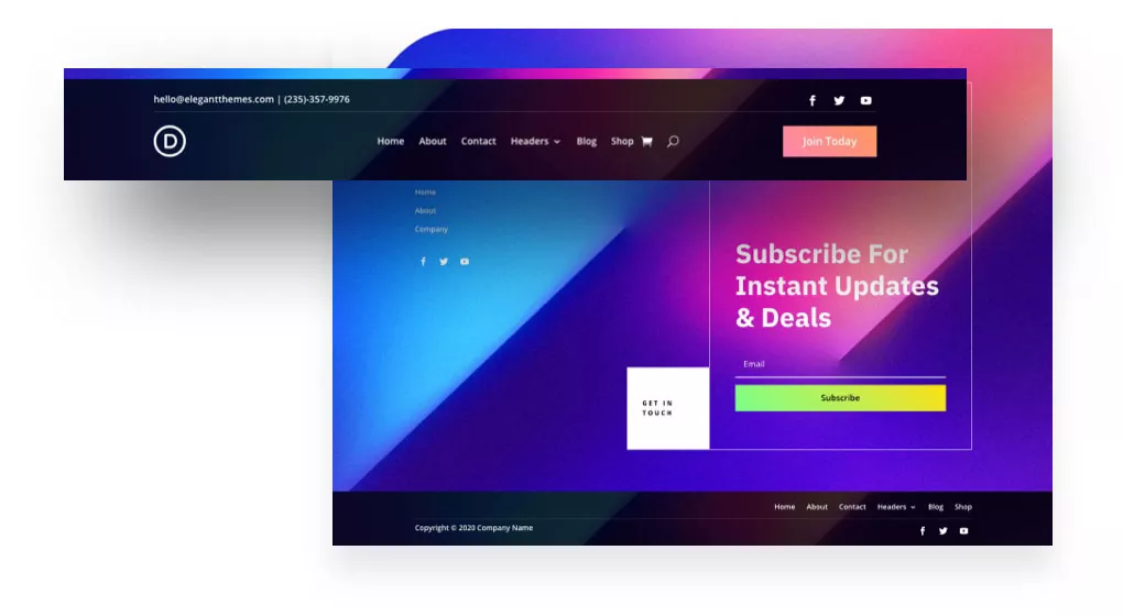
The Anatomy of a High-Converting Website Header
A website header is the first thing a visitor sees, regardless of which page they land on. It’s a constant, a beacon of your brand identity and the primary tool for navigation. An effective header must achieve a delicate balance between being informative and uncluttered, guiding users without overwhelming them. Its design directly influences whether a user feels confident and stays to explore or gets confused and bounces away.
Core Components of an Effective Header:
- Logo and Brand Identity: Your logo is the visual anchor of your brand. It should be placed prominently, typically in the top-left corner (as users in Western cultures read from left to right), and it must always link back to the homepage. This is an unbreakable convention of web design that users instinctively expect.
- Intuitive Primary Navigation (Menu): This is the roadmap to your site’s most important content. Use clear, concise labels for your menu items (e.g., ‘Services’, ‘About Us’, ‘Contact’). For content-heavy sites, consider a well-structured mega menu, but ensure it doesn’t become a source of cognitive overload. The goal is to help users find what they need in the fewest clicks possible.
- Compelling Call-to-Action (CTA): What is the single most important action you want users to take? ‘Get a Quote’, ‘Book a Demo’, ‘Shop Now’. This primary CTA should be visually distinct, often designed as a button with a contrasting color, and placed in a prominent position, usually on the top-right.
- Search Functionality: For any site with more than a dozen pages, a search bar is essential. It empowers users to find specific information quickly, dramatically improving the user experience and reducing frustration. Modern search bars often use predictive text to offer suggestions, further streamlining the process.
- Utility Navigation: This secondary set of links often includes access to user accounts (‘Login/Register’), the shopping cart icon for e-commerce sites, language switchers for multilingual audiences, and sometimes contact information like a phone number.
Header Design Best Practices for UX and SEO
- Embrace Simplicity and White Space: A cluttered header is a confusing header. Prioritize the most critical elements and use ample white space to create a clean, organized, and professional first impression.
- Implement a ‘Sticky’ or ‘Fixed’ Header: A sticky header remains visible at the top of the screen as the user scrolls down the page. This provides persistent access to navigation and the CTA, which is proven to improve navigation efficiency and can increase conversions. However, ensure it’s not so large on mobile devices that it obstructs content.
- Ensure Flawless Mobile Responsiveness: On smaller screens, the header must adapt gracefully. The standard practice is to collapse the main navigation into a universally recognized ‘hamburger’ icon (three horizontal lines). Ensure the logo scales down appropriately and the CTA remains easily tappable.
- Optimize for Speed and Core Web Vitals: Your header is one of the first elements to load. Large, unoptimized images or complex scripts can slow down your site’s Largest Contentful Paint (LCP) and cause Cumulative Layout Shift (CLS), negatively impacting both SEO and UX. Keep header elements lightweight and efficient.
- Use Correct Semantic HTML: Structure your header with the `
` tag and your navigation menu with the `
The Website Footer: Your Site’s Foundational Safety Net
If the header is the grand entrance, the footer is the helpful concierge at the end of the hall. Users who scroll to the bottom of a page are often looking for specific information they couldn’t find above. A well-designed footer anticipates these needs and serves as a secondary, more comprehensive navigation system, a hub for trust signals, and a powerful tool for internal linking.
What Belongs in a Modern, SEO-Friendly Footer?
A ‘fat footer’—one that is well-organized and rich with useful links—is a modern best practice. Instead of a single line of text, it uses columns to logically group information, acting as a mini-sitemap.
- Expanded Navigation: Include links to important but secondary pages that don’t fit in the primary header navigation. This can include ‘Careers’, ‘Press’, ‘FAQ’, ‘Blog’, or specific service pages. Organize these under clear headings like ‘Company’, ‘Resources’, and ‘Services’.
- Contact Information and NAP: For local SEO, including your business Name, Address, and Phone number (NAP) is crucial. Make sure this information is consistent with your Google Business Profile. Including an email address and a link to your contact page is also standard.
- Trust and Credibility Signals: Display logos of awards, certifications, security seals (like SSL), and key partnerships. This social proof builds credibility and reassures visitors, which can have a direct impact on conversions.
- Legal and Compliance Links: Every professional website needs links to its ‘Privacy Policy’, ‘Terms of Service’, and any other relevant disclaimers. This is essential for legal compliance (like GDPR) and demonstrates transparency to your users.
- Social Media Icons: Provide clear, simple icons linking to your active social media profiles. This encourages users to connect with your brand on other platforms and helps build a community.
- Lead Generation Element: The footer is an excellent, non-intrusive place to include a newsletter signup form. A user who has reached the bottom of your page is already engaged, making them a prime candidate to subscribe.
- Copyright and Branding: The copyright notice (e.g., ‘© 2024 Asa Rad Co. All Rights Reserved.’) is a standard legal component. It’s also a good practice to include your logo again for a final touch of brand reinforcement.
Footer Design Best Practices for UX and SEO
- Prioritize Hierarchical Organization: Don’t just dump links. Use columns, bold headings, and white space to create a clear visual hierarchy that is easy to scan. Group related links together logically.
- Focus on Readability: Footer text is often too small. Ensure the font size is legible and that there is sufficient color contrast between the text and the background to meet accessibility standards.
- Use Descriptive Anchor Text: The links in your footer are a powerful internal linking tool. Use keyword-rich, descriptive anchor text (e.g., ‘Learn About Our Web Design Services‘) instead of generic terms (‘Click Here’). This provides context to both users and search engines.
- Avoid Keyword Stuffing: While internal linking is valuable, avoid cramming the footer with dozens of low-value, keyword-stuffed links. This looks spammy to both users and Google and can harm your SEO. Focus on links that provide genuine value to the user.
- Add a ‘Back to Top’ Button: For long pages, a simple ‘Back to Top’ arrow is a small UX enhancement that users appreciate, saving them the effort of scrolling.
Conclusion: A Strategic Investment in Your Digital Foundation
Meticulous website header and footer design is not a luxury; it is foundational to a successful digital strategy. These elements are the unsung heroes of usability and visibility, working tirelessly on every page to orient users, reinforce brand identity, build trust, and guide search engine crawlers. By treating them as strategic assets, businesses like Asa Rad Co can create a seamless, cohesive user journey that supports critical business goals.
By implementing the best practices outlined in this guide—from clean navigation and compelling CTAs in the header to organized information and strategic internal links in the footer—you can transform these often-neglected sections. An investment in optimizing your website’s header and footer is a direct investment in better user engagement, stronger SEO performance, and ultimately, a more powerful and effective online presence in a competitive digital world.
Frequently Asked Questions
Why is a website header so important for first impressions?
The header is the very first element a user interacts with, forming an instant impression of your brand’s professionalism and credibility. It sets the tone for the entire user experience by clearly presenting your brand identity, establishing trust, and providing a simple, intuitive roadmap to navigate the rest of your site. A confusing or poorly designed header can lead to high bounce rates.
What are the most essential elements for an SEO-friendly website footer?
An SEO-friendly footer should include categorized links to important pages using descriptive anchor text, which helps search engines understand your site structure. It’s also crucial to have consistent NAP (Name, Address, Phone) information for local SEO, links to legal pages like your Privacy Policy, and trust signals such as certifications or awards, which can indirectly influence rankings by improving user trust and engagement.
How does a mobile-responsive header improve user experience?
A mobile-responsive header, typically using a hamburger menu, ensures that navigation remains accessible and easy to use on small screens without cluttering the viewable area. This provides a seamless experience, allowing mobile users to find information just as easily as desktop users. A non-responsive header can be frustrating to use, leading to site abandonment.
Can having too many links in the footer hurt my SEO?
Yes, it can. While strategic internal linking is beneficial, a footer crowded with hundreds of links, a practice known as ‘link dumping,’ can be seen as spammy by search engines. It can dilute link equity and signal an attempt to manipulate rankings rather than provide user value. Focus on a well-organized, curated list of links that genuinely help the user navigate your site.
What is a ‘sticky header’ and should I use one for my website?
A sticky (or fixed) header is one that remains visible at the top of the viewport as the user scrolls down the page. They are generally recommended because they provide persistent access to navigation and key CTAs, which improves usability. However, on mobile devices, you must ensure the sticky header is not so tall that it obstructs a significant portion of the screen’s limited real estate.
How do headers and footers impact Core Web Vitals?
Headers and footers can significantly impact Core Web Vitals. Large images or fonts in the header that load late can cause Cumulative Layout Shift (CLS), frustrating users. Heavy scripts or elements can also slow down the Largest Contentful Paint (LCP). Optimizing all header and footer assets for speed is crucial for passing Core Web Vitals assessments and improving both SEO and UX.
What’s the difference between UI and UX in header design?
UI (User Interface) refers to the visual elements of the header—the colors, fonts, button shapes, and spacing. UX (User Experience) is about the overall feel and ease of use. For example, a beautiful button (UI) that is hard to find or doesn’t clearly state its purpose provides a poor experience (UX). Great header design requires both a clean UI and an intuitive, seamless UX.
How can I build user trust using my website’s footer?
The footer is an excellent place to build trust and credibility. You can achieve this by providing transparent access to legal documents like your Privacy Policy and Terms of Service. Displaying trust seals, security badges, industry certifications, customer testimonials, or awards also reassures users that your business is legitimate and trustworthy, encouraging them to engage further.