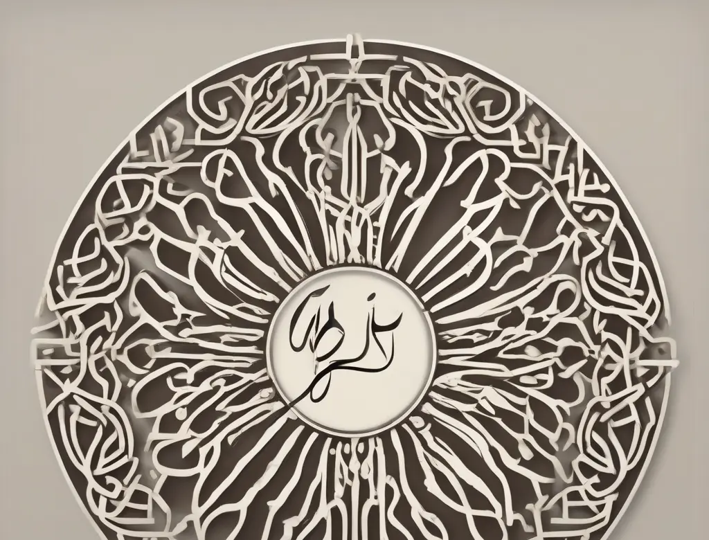
How to Choose the Best Typography for Persian Logotype Design?
Selecting the appropriate typography for a Persian logotype is one of the most critical and impactful steps in designing a brand’s visual identity. Typography not only conveys a brand’s personality and values but also ensures its readability, memorability, and professionalism. In Persian, due to the nature of its letters, ligatures, and letter extensions, choosing the right font holds even greater significance. This article will delve into the key criteria and essential tips for selecting the best typography for Persian logotype design.
The Importance of Typography in Persian Logotypes
A logotype, or text-based logo, is more than just a collection of letters; it encapsulates a business’s visual identity in a concise and memorable format. The right choice of typography can communicate your brand message more effectively, while an incorrect selection may lead to audience confusion, diminished brand credibility, and even lost business opportunities.
In the Persian language, connected letters and the various forms letters take present unique challenges for designers. A font that is readable and beautiful in a Latin script may not necessarily be suitable for Persian. Therefore, a deep understanding of Persian typography’s characteristics and aligning them with the brand’s identity is crucial.
Key Criteria for Choosing Typography
To select the best typography, several important criteria must be considered:
1. Alignment with Brand Identity and Personality
The first and foremost step is a deep understanding of the brand and its personality. Is your brand modern, minimalist, and simple, or classic, traditional, and artistic?
- Modern and Simple Brands: Sans-serif fonts with clean lines and varying weights (such as Iran Sans, Shabnam, or Vazir fonts) are ideal choices. These fonts convey a sense of simplicity, clarity, and modernity.
- Classic, Artistic, or Luxury Brands: Fonts with finer, more intricate lines, or even those inspired by modern Nastaliq script (like some versions of B Nazanin or Titr fonts), can be suitable options. These fonts evoke a sense of heritage, elegance, and history.
For instance, a tech startup might use simple, readable fonts to convey innovation and efficiency, whereas an art gallery might opt for a font with more character, perhaps slightly unconventional, to reflect its creativity.
2. Readability and Clarity
The logotype font must be easily readable at any size, from the smallest app icon to the largest billboard. This aspect becomes even more critical in Persian:
- Internal Space (Counter): The empty space within letters like ‘O’ or ‘A’ must be sufficiently open to ensure legibility at small sizes.
- Letter Spacing (Kerning) and Word Spacing (Tracking): Precise adjustment of the spaces between letters and words is vital to prevent them from appearing too cramped or too spread out. Some fonts have better default kerning.
- Ligatures: In Persian, combinations of certain letters (like ‘la’ or ‘le’) appear as a single character. The chosen font must render these ligatures correctly for a professional and flawless appearance.
Testing the font at various sizes and under different lighting conditions is essential. Choose a font where individual letters remain distinct even at the smallest scale, allowing the reader to effortlessly grasp your message.
3. Scalability and Media Compatibility
Your logotype will be used across a wide range of platforms and media, from business cards and websites to mobile apps, letterheads, and product packaging.
- Multiple Font Weights: Selecting a font with various weights (such as Light, Regular, Medium, Bold) provides greater flexibility for different designs. For example, the Bold weight can be used for the main title, and the Regular weight for descriptions.
- Compatibility with Digital and Print Platforms: Ensure the chosen font maintains its quality and readability in both digital environments (web, apps) and print (brochures, signage).
A good logotype should retain its impact across vastly different scales, from minuscule app icons to large billboards.
4. Uniqueness and Copyright
Your logotype should represent a unique brand. Using overly common or repetitive fonts might cause your logo to get lost among competitors.
- Custom Fonts: If possible, designing a custom font for the logotype is the best way to achieve uniqueness. This is usually costly but yields exceptional results.
- Commercial Use License: When choosing ready-made fonts, always verify that you have a Commercial Use License. Using free fonts for commercial purposes without the proper license can lead to legal issues.
- Creative Modifications: Even with a standard font, creative modifications to the letters, adding unique details, or combining it with a graphic element can result in a distinctive logotype.
If you cannot find a completely unique font, focusing on creativity in layout, color, and composition can help differentiate your logotype.
The Selection and Design Process
Choosing the right typography is an iterative process that requires trial and error:
- Research and Information Gathering: Thoroughly examine the brand’s personality, target audience, competitors, and current design trends.
- Font Search: Visit reputable Persian font resources and select fonts that align with your brand’s personality.
- Font Testing: Write your brand name using the selected fonts and test them in various sizes and combinations.
- Readability Assessment: Place the chosen fonts at small sizes and against different backgrounds (light and dark) to evaluate their legibility.
- Gather Feedback: Share initial designs with colleagues, potential clients, or other designers to solicit their opinions.
- Final Adjustments: After selecting the final font, fine-tune the kerning, weight, and other details to achieve the optimal visual result.
Additional Tips for Persian Logotypes
- Use Standard Persian Fonts: Fonts like Iran Sans, Vazir, Shabnam, Iran-yek Sanz, etc., designed by prominent Iranian designers, are typically safe and professional choices for logo design.
- Pay Attention to Ligatures: In Persian, the combinations ‘la’ and ‘le’ are very common. Ensure your chosen font displays these combinations beautifully.
- Letter Extensions: Some Persian letters can be extended. This feature can be used creatively in a logotype but must be done carefully, preserving readability.
- Combine with Graphic Elements: Sometimes, combining typography with a simple symbol or icon can make your logo more powerful and memorable.
Conclusion
Selecting the appropriate typography for a Persian logotype is a blend of art, knowledge, and a deep understanding of the brand. By considering criteria such as brand identity alignment, readability, scalability, and uniqueness, you can choose a font that best represents your business.
We recommend consulting with the graphic design experts at Asa Rad to select the best font and design a professional logotype.
Sources :